Paola Moya is a Colombian-American entrepreneur known for founding MOYA. As CEO and Creative Director, she plays a multifaceted role of overseeing the design content and business direction of the companies. Her entrepreneurial ventures span diverse design fields including urban design, architecture, interiors, experiential design, communication strategies, digital
media, and graphic design. Her approach to business and design is holistic, rooted in diverse perspectives and international influences, a philosophy that resonates throughout her team at MOYA.
In her leadership capacity, Paola places a strong emphasis on the value of a diverse and interdisciplinary team with a global outlook. She advocates for design excellence, and her companies are distinguished by their dedication to social causes. This is particularly evident in their work on affordable housing, support for non-profits, and organizing events like Art After Dark, which champions artists of color and tackles homelessness.
Paola’s portfolio includes several high-profile projects in the Washington DC metropolitan area. These range from the site selection study for the Latino American Museum and American Women Museum to the renovation of the historic Howard Theatre, Audi Field, MGM National Harbor, public schools, thousands of affordable and market rate units and more. Her graduate
thesis, awarded the highest award by the National Organization of Minority Architects (NOMA), was presented at the United Nations-sponsored World Humanitarian Summit as a solution for internal displacement in Istanbul. Her work has been acclaimed by numerous organizations, including AIA, NOMA, the International Design Awards, and Built by Women.
Her career is decorated with numerous honors. The Washington Business Journal recognized her as one of the “Power 100 Playmakers” and a “Minority Business Leader of the Year.” She has been acknowledged for her firm’s impact on the city’s architecture and was part of the “Woman Who Mean Business” class in 2020. Additionally, she received the Milton F. Clogg Outstanding Alumni Achievement Award from Montgomery College, and in 2022, the international WAN Female Frontier Awards. Her achievements have been spotlighted in Architect magazine, Huffington Post, Fox News, and CNN. In 2021, Paola was honored for her contributions to the economy and community during a discussion with Vice President Kamala Harris and Congresswoman Nanette Diaz Barragán, which focused on supporting Latina entrepreneurs and addressing systemic issues through the Biden�Harris Administration’s infrastructure bills.
Paola’s leadership extends beyond her professional achievements, as she emphasizes the importance of investing in family, friends, and self. She divides her time between Washington DC, North Carolina, and Medellin, alongside her husband Neil and dog Charlie.
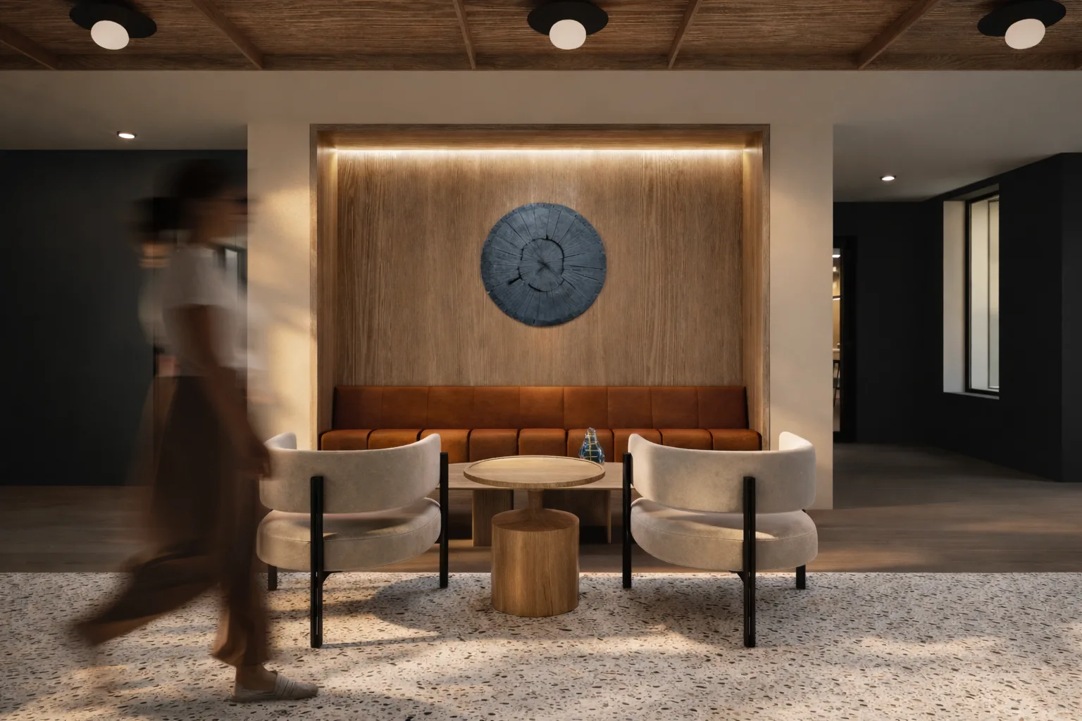
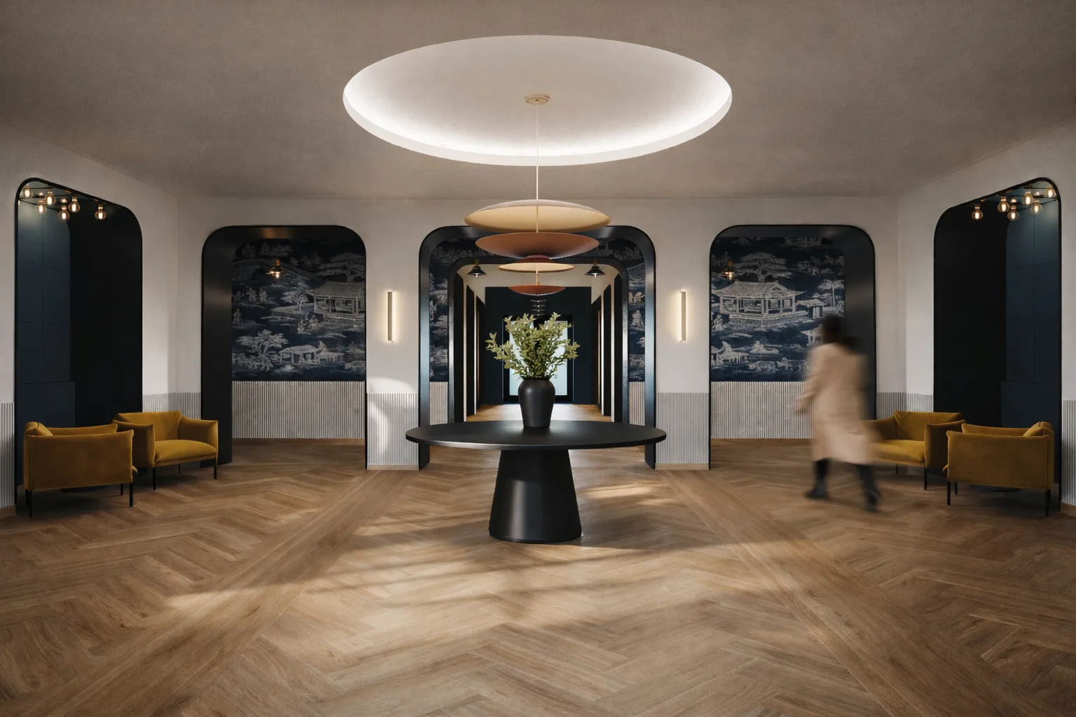
Paola Moya is an award-winning architect and design leader with over 23 years of experience in architecture, interior design, and experiential environments. As CEO of MOYA, she guides visioning, design strategy, and client relationships for educational, civic, and nonprofit projects. Paola’s leadership is marked by her ability to balance design excellence with community impact, budget efficiency, and historic preservation. She has extensive experience with school modernizations, small nonprofit facilities, and adaptive reuse projects, working closely with agencies such as the District of Columbia Public Schools, the DC Department of General Services, and the DC Historic Preservation Office, to ensure compliance and stakeholder alignment. Her portfolio reflects a commitment to creating inclusive, high�performance spaces that reflect each client’s mission and identity.
Role on the Project
As the Architectural Principal in Charge, Paola will lead all phases of the project, ensuring design excellence, Academy of Hope satisfaction, and adherence to budgets and timelines. She will coordinate project teams, oversee quality, and will be responsible for key relationships and project success.
Experience and Qualifications
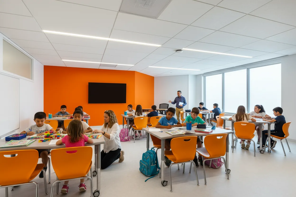
DCPS Alice Deal Middle School Expansion | Washington, DC | Design Principal in Charge | $18.5M | 22,500 SF | 2024 | LEED Gold certified | Led the expansion and renovation of a historic middle school to include new classrooms, science labs, dining areas, a revitalized courtyard, and LEED certification. Oversaw permitting and agency coordination with DCPS and HPO.
Historic Randle Highlands Early Learning Center | Washington, DC | Design Principal in Charge | Full project involvement | $14M | 20,865 SF | 2022 | LEED Gold certified | Modernization of a historic early childhood center. Led QA/QC for building envelope restoration, interior fit-out, and early learning spaces.
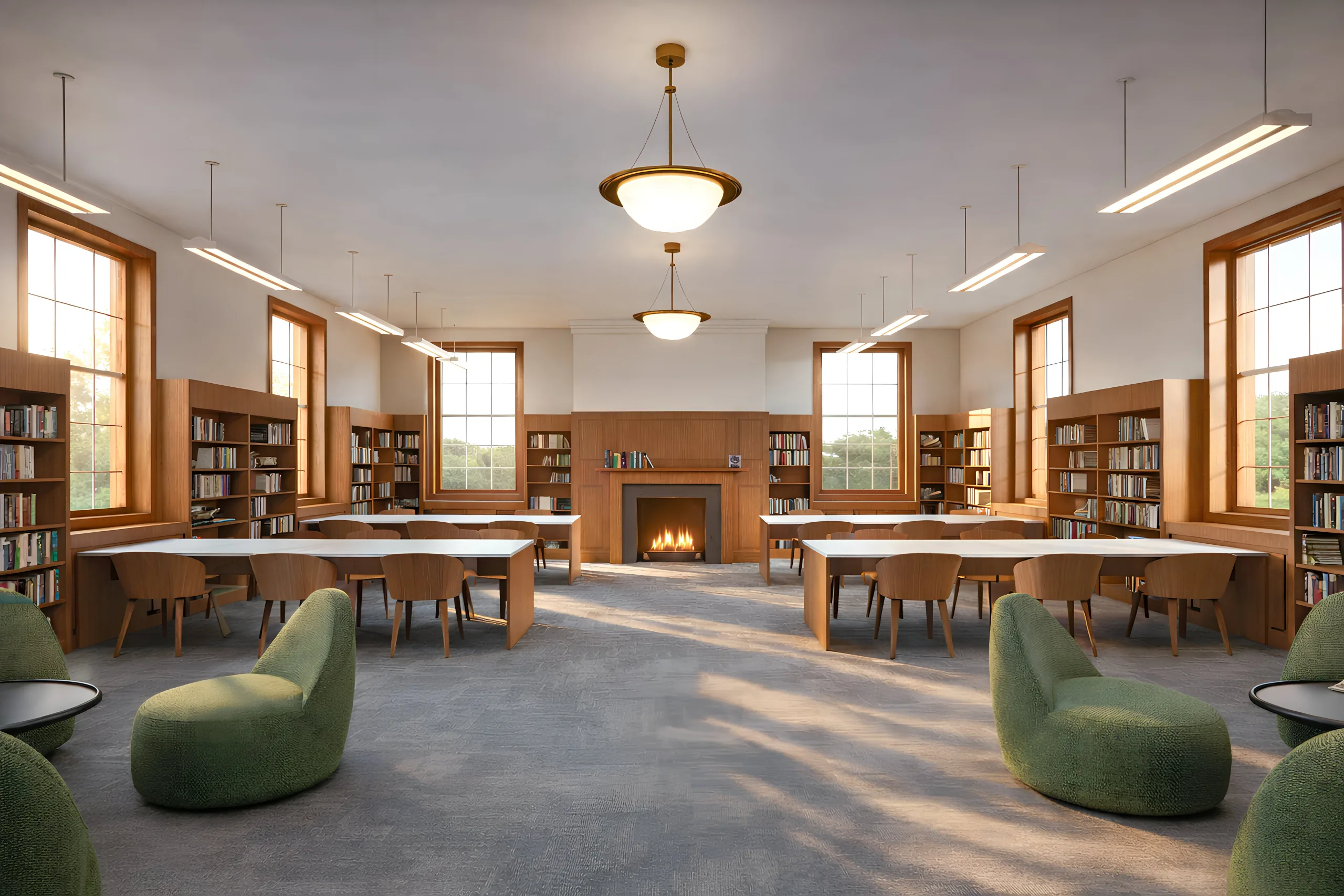
Horace Mann Elementary School Modernization and Expansion | Washington, DC | Design Principal in Charge (representing Marshall Moya Design) | $37.7M | 40,000 SF | 2015 | LEED Gold certified | Led the design, in partnership with the DGS, DCPS, CFA, HPO, SIT committee members, and Skanska, emphasizing the creation of spaces that seamlessly integrate indoor and outdoor learning environments and included an art room, science gallery, library and multipurpose room, each conceptualized with versatility in mind.